
SAN DIEGO —
Researchers at Georgia Tech have released a geographic COVID-19 risk calculator for events in different counties in the United States, including in San Diego County.
“The risk is not necessarily the same wherever you are,” said Clio Andris, an Assistant Professor at Georgia Tech who worked on the project. “The risk isn’t homogenous, so showing the risk in spatial variation is very important.”
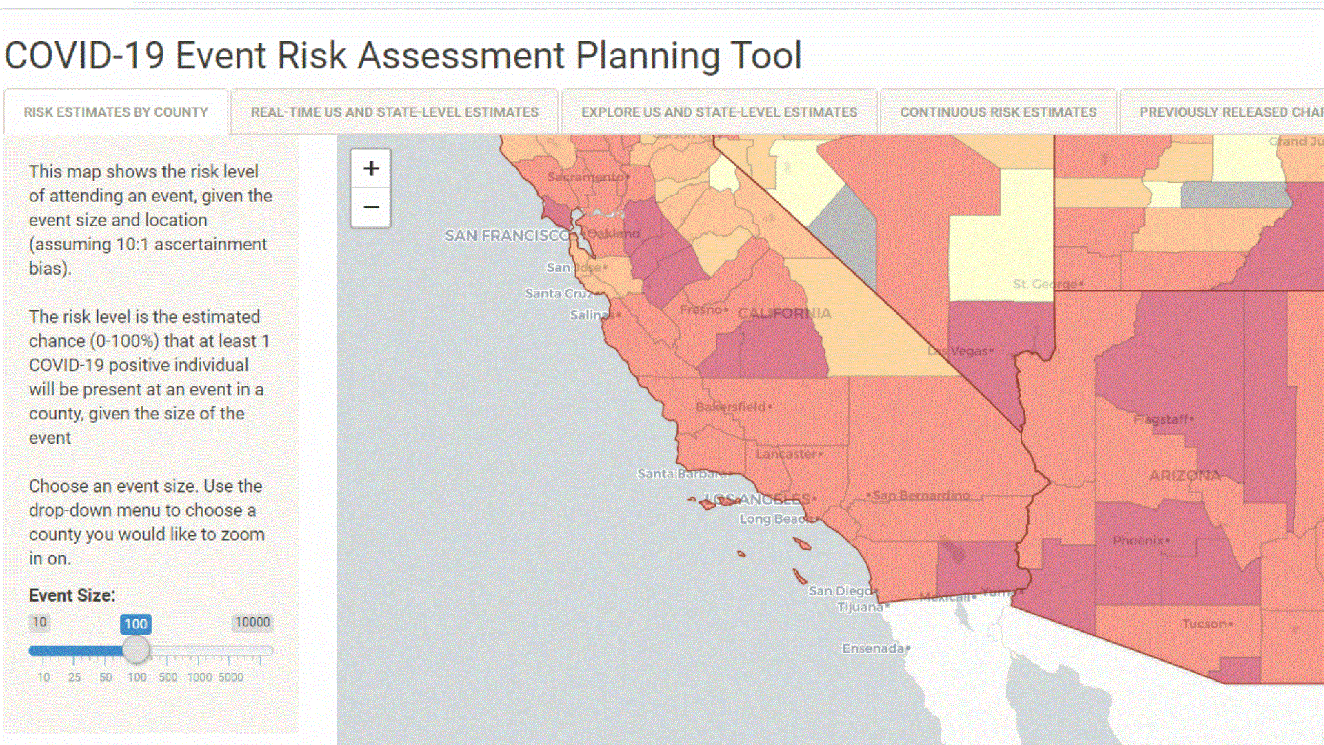
For example, let’s say someone wants to attend a wedding in San Diego County with 100 attendees. Now, there’s a targeted tool to calculate that risk based on regularly updated data. The risk level is the estimated chance (0-100%) that at least one COVID-19 positive person will be present at an event in a county, given the size of the event. So, if you use the sliding scale and click on San Diego County, you’ll see that the probability of contracting COVID-19 at a wedding with 100 people in San Diego County is 88%.
Andris is on a team with three graduate students lead by Dr. Joshua Weitz. The team does research on mapping and spacial analysis, so taking in data with a spacial location attached to it to study patterns. The team started working on the project in January when they wondered about the probability someone at a small event or concert would have COVID-19.
“Early on, it was just a probability for the whole U.S.,” said Andris. “Then, the group broke it down into states and now our most recent development is that we broke it down into counties.”
This data takes the acertainment bias into account, or the assumption that there are probably ten times the amount of COVID-19 positive people out there than what’s confirmed. After all, many people with coronavirus are asymptomatic and may never get tested for the virus - unaware they are spreading it to others. Andris said the team may change this in the future.
When you click around the map on different counties and adjust the sliding scale representing the number of people at an event, the probability changes. So, for example, the probability of contracting COVID-19 at a wedding of 100 people in Goshen County, Wyoming is only 20%.
“The data sets are mostly based on population, so what the population of the county is, what the number of cases per county [are] per day - that changes - and we get that data from the New York Times,” said Andris.
People all over the world are using the tool, including in California.
“The map was a lot more popular than we originally anticipated,” said Andris. “We hoped it would be popular, but we’re really glad to see that it’s getting about 300,00 hits today, maybe even more.”
Andris said many people are passing along this mapping tool to loved ones that may be engaging in higher risk behaviors, like attending a large gathering.
“Maybe we all have somebody in mind who is sort of on the outlier of doing more things [like] hosting weddings, having large gatherings, having rallies for example - political rallies - and make them kind of stop and think ‘this is a riskier thing than I realized’ and you can actually measure this risk,” said Andris.
The mapping tool also identifies counties with a higher number of cases.
“We’ve seen the South pop up as a huge hotspot,” said Andris. “We’ve seen Arizona increase a lot and some parts of California.”
“We did notice that Imperial County was very, very high,” Andris added.
Andris applauded the Northeast for its public health efforts.
“They seem to be doing the right thing up there,” said Andris.
The project does come with challenges, however. Some counties have little or no data available. For example, some rural U.S. counties have only about 100 people. Andris said these areas are also less likely to have major hospitals.
Andris said the code behind the map is written in R, and is deployed using the R Shiny package. The boundaries are generalized from the U.S. Census TIGER line county shapefiles .The basemap is from OpenStreetMap and Leaflet and Carto are both used to display the map.
Andris said the group is mainly putting this free tool together as a volunteer project, although Weitz has some grants for COVID-19 research.
“This is really a labor of love for our team,” said Andris.
The three graduate students are Aroon Chande, a PhD student in Bioinformatics at Georgia Tech who works with the Applied Bioinformatics Laboratory, Mallory Harris, a PhD student in the Department of Biology at Stanford, and Seolha Lee, an MS student in City and Regional Planning.
You can explore the map planning tool here.